
We love a great Data Visualisation

Data is great!
But there is absolutely no point to it unless we do something with it.
Data needs to be presented in a way that is clear, simple to understand and allows us to make decisions with it. This is why data visualisation is so powerful. However, we all absorb information differently, so our visualisations need to be tailored to the data and the audience in order to tell the best story.
Maps are a classic example of effective data visualisation. Look at how Google Maps has transformed all our lives by making complex geographical data accessible and useful. There is so much complex information that can be presented in such in intuitive format.
Similarly, with weather forecasting. Raw data from measurements like pressure, temperature, and precipitation are recorded along with time and position. For most people, this raw data is incomprehensible and useless. (Trust me. I’ve been looking at it).
All we really want is a simple map showing if it will be warm and sunny tomorrow.
There are many ways to visualise data, each suited to different types of information and audiences. Our minds expect certain formats, and there are numerous psychological studies on how we interpret visual data. There are many studies into this, but the Gestalt Principles embody these best. This is a useful description that avoids too much deep psychology.
What are the Gestalt Principles?
Let’s get back to basics
The most basic visualisation is a line graph with a horizontal x-axis (dimension) and a vertical y-axis (measure).
Often, the x-axis represents time, showing trends like sales volume over a period. Adding multiple lines can show comparisons, such as sales in different regions, with each line in a different color or style. You can also use this format to create a scatter plot, showing individual points with a trend line running through them. Its extremely versatile and one we will all remember from school.

Scatter plot
Close behind in the simplicity stakes are bar graphs that can summarize totals, like annual sales by territory. These are better when you are trying to show distinct values and not interpolate between points.
You can amend these to stack totals together or compare groups together. These are really useful for direct comparison, but need to be kept really simple. Too many bars and it become bewildering.

Bar chart, comparing three items over months.
Dashboards
You can present your information in a static format in a very simple fashion. This is great for quick hits, but you need to ensure that is all your audience requires.
Dashboards can offer multiple complementary visualisations along with supporting information. They can be really helpful for telling a bigger story, but it is essential that it remains focussed. Unnecessary visualisations can easily jar.
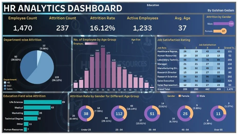
HR Dashboard showing multiple visualisations within a common theme.
The point of any visualisation is to tell a story. It should be clear and to the point. It can lead to further detail if desired.
It is easy to try to put as much information in there as possible, but ensure that you focus on the story that you are telling and make sure that it is obvious. Clean and simple always wins.
Here are my top tips
Calibrate: Always include actual values. A curve showing progress over time is good, but without values, it's not very useful.
Label: Clearly label axes and units. For example, specify if values are in GBP or USD to avoid confusion.
Use Colour: Colour highlights key points. Greying out less important information helps focus attention.
Be Consistent in Dashboards: Ensure all information is relevant and consistent. Stick to a house theme, using the same colours and formats consistently. If you assign specific colours to specific items of sales areas, don’t change them for other visualisations.
Offer Interactive Elements: Add filtering options for deeper data exploration but keep interactions consistent to avoid surprises.
Keep It Simple: Avoid overcomplicating your visuals. The goal is to convey a message, not to showcase your technical skills.
Favourite Visualisations
There are a number of new types of visualisations that have become popular over time.
Many are especially appropriate on social media where quick short hits can be appropriate.
Here are some of my favourites.
Wordclouds:
Great for sentiment analysis and seeing what the mood is. This breaks my previous rule of having a grounded measurement. However there needs to be some understanding of what the size relates to. (The default is always frequency of use)

A wordcloud created from this article
Sankey Diagrams:
I was introduced to these by a colleague who absolutely loved them and I’ve seen some interesting uses recently. These work when showing transition between different states, but again, need to be kept simple and not too busy.
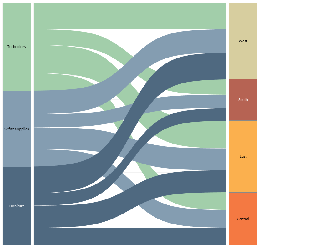
Sankey Diagram showing where products are sold.
Choropleth maps:
I’ve done a lot of geo-mapping and there are many ways of plotting the data. Point locations, cluster mapping or heat maps are all options, but I always like highlighting by areas, eg postal areas. These are typically used to show market penetration in various areas and are called Choropleth maps. I always like the area ones as these just look more beautiful.

Population change by county.
Line Graph:
To be honest, my favourite graph will always a line graph with an x and y axis. Its dependable, practical and interchangeable.
Conclusion
Effective data visualisation translates complex data into clear, actionable insights. By following these tips and choosing the right type of visualisation, you can create compelling visuals that tell a clear story and facilitate better decision-making.
Make sure that you have the right data, the right tool and a clear view on the story that you are telling and you won’t go far wrong.